Showing posts with label Drawing book Julie Douglas. Show all posts

Sunday, 6 January 2019

Portrait next step - transferring to canvas.

This shows my artwork in progress - getting the drawing onto my canvas ready to paint. 

The finished drawing (centre) with the painted tracings on the right, and the canvas with transferred image on the left. 
The film shows some of the process. 


Up and coming workshops at Belfast Academy of Realist Art: Friday Night Life drawing (every second Friday evening), Portrait weekend, Life Drawing weekend, PET PORTRAIT weekend and the new term of weekly classes.
April 8th - 12th 2019, Paul Foxton at BARA!
For info please email julie@juliedouglas.co.uk

Portrait progress number 3!

After many days longer than I expected, I finished the drawing of Vernon. These photos show the progress, with the finished artwork at the bottom. 


When I started, I thought the beard was going to be the most challenging part, but I think perhaps the hat was just as 'interesting'... 

The yellow-look to the photo is because I photographed it at night. 


By the time I began working on the area around the figure I realised that the job was not nearly over, yet...!! 

The big cover-up. It is important to keep the paper clean, and the only way to enqure there are no grubby smudges is to expose only the area being worked on. It's a rest for my eyes too.  
Starting the foliage
The background tone. Yet another challenge in gentleness and even handling. 

DA-NAAAAA!! 
Of course, this is only the prep for the oil painting! I had a day off before transferring the image on to canvas. See the next post!

Portrait progress number 2, in film!


Pencil is not easy to photograph so please forgive the quality. Pencil drawing by Julie Douglas

I wanted to show the progress since my last post so here is another little film. 


Saturday, 4 November 2017

A lovely bit of homework! Student water colours.

I don't actually set work for my students to complete at home, but sometimes - particularly if they have missed a session - someone will put in a bit of time at their own drawing board. It is very rewarding for me to see the results.
Brigid's painting - amazing!!
The painting above, by Brigid, was started during a class,  and she took the leaf home and finished it. I think it's totally beautiful.

Lovely colours and composition by Liz 
Notice how the colour-restrictions were noted on the side of the page - it's always worth doing exercises with a restricted number of colours. Not only does it give the painting a lovely unified feeling, it also helps you understand the range of colours at your disposal.
Another lovely design by Pauline

A lovely spread of studies by Dawn. They look real! 
Notice lots of colour 'tiles' on the left page of Dawn's lovely book (above), testing the mixes before putting them onto the drawing. The dark red leaf on the left page is the actual leaf, but all the others are Dawn's paintings.

 The painting above and below is by Sara, who worked in this at home. The photo above shows that Sara did a wonderful job of getting the leaves just about same-size as the original (the real leaf is on the paper at the top). This photo shows the first layer, a 'wash' of lemon yellow.

Sara's lovely artwork

 Above - the finished artwork, totally delicious. Below, the leaf itself didn't last so long!!!


My book, Notes from The Atelier, has now got over 40 five-star reviews on Amazon! Available on Amazon, or directly from me (a bit cheaper!).


www.juliedouglas.co.uk
email:  julie@juliedouglas.co.uk 

Sunday, 2 April 2017

Talking Drawing with Kim Leneghan, BBC Radio

Just home from a breakfast interview with the lovely Kim Lenaghan on BBC Radio Ulster. Well, I say 'breakfast', but 7am on a Sunday is way beyond breakfast for me... 


Kim said that she'd LOVE to be able to draw and paint, and showed me photographs of her lovely Lurcher dog, so I have challenged her to take a few lessons and we'll see if we can't get rid of a few of those self-doubting thoughts and phrases, and turn her doodles into delicious drawings! 

Here's the programme!

http://www.bbc.co.uk/programmes/b08kxpck


TODAY: Book launch and art display, The Engine Rooms, 5 Donegall Square South, Belfast. 3 - 6pm all welcome! 


Friday, 3 March 2017

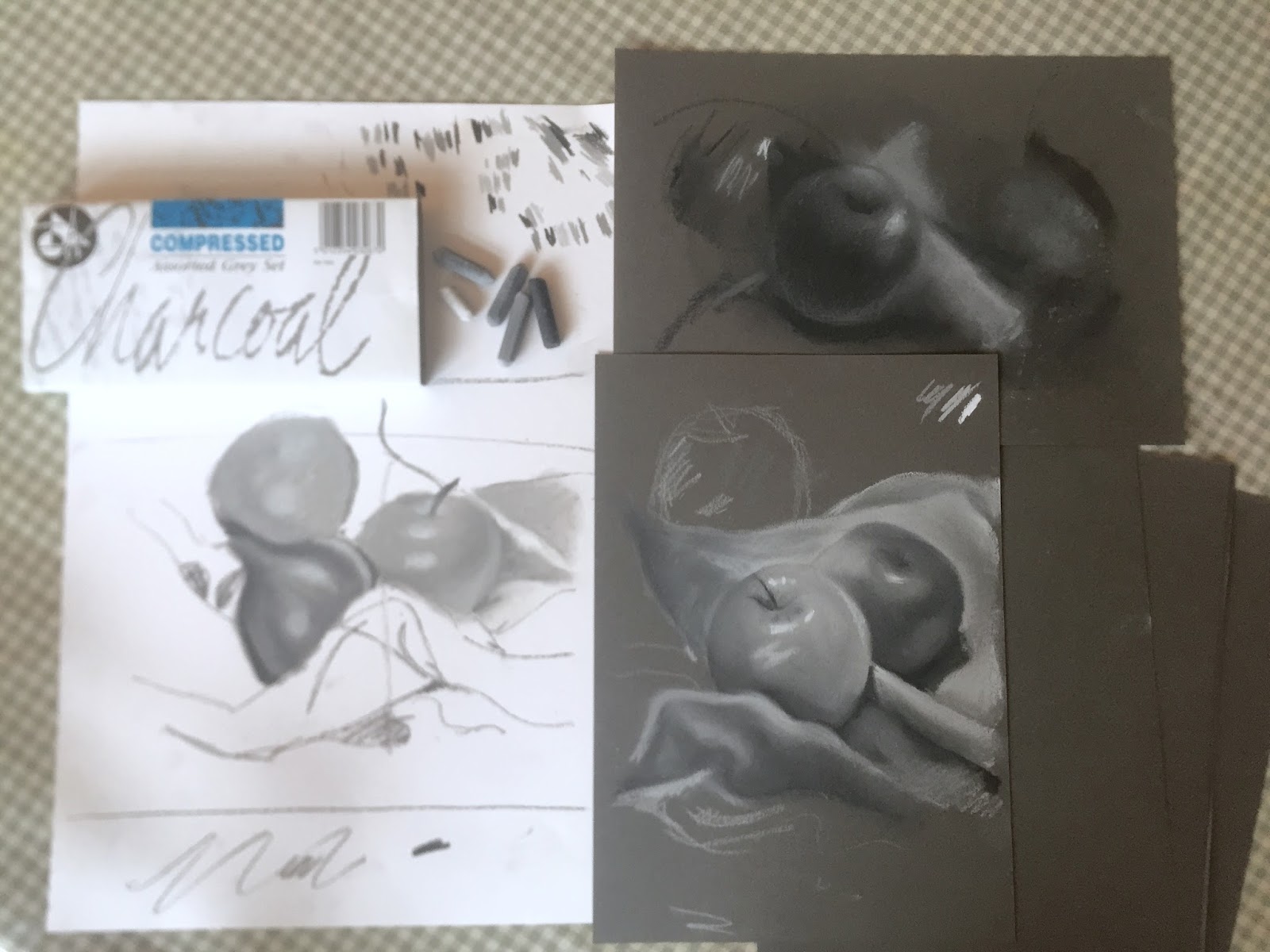
Compressed Charcoal, tonal studies of apples and onions!

Compressed charcoal is a delicious, and very flexible medium. Recently I gave my students the task of producing two drawings in one session, first on white cartridge paper, then on thicker, mid-toned grey paper.

My demo drawings, with the Compressed Charcoal box top left. 
While most of us enjoy colour (after all, we do live in a colourful world!), working in black and white really improves our abilty to see subtle variations in tones. These same tones are necessary in our colour work too but easily overlooked, giving an unsatisfactory result without depth.

Demo showing the variety of tones, using only three greys, and white.
Graphite pencil is excellent for training our eye to see subtle nuances in tones, but using compressed charcoal allows us to cover the whole area in a shorter time frame, helping us to remember to compare tones in areas all across the page (relative to each other) as well as tonal variations which are close together.


My quick demo on tinted card, with darker tones left hatched rather than blended.
After arranging the apples and onions pleasingly on cloth, the drawing was lightly mapped in, and the tonal challenge began in earnest. Unlike charcoal, the compressed sticks come in a range of 4 greys plus black and white. The challenge was to remember to change the stick as we went along - leaning more heavily or lightly doesn't alter the tone. 

Lovely artwork by Brigid
Another great study by Gavin, who enjoyed the challenge so much that he spent the full session on this artwork. 
It's a dirty business, but once we get stuck in, we become more absorbed in observing the subject than worrying about chalky fingers! We worked on white paper first, and enjoyed the differences when we moved on to the tinted grey paper.

Dawn, blending nicely 
Working on tinted paper means that the whites really sing out brightly. it is also a pleasure to add highlights, rather than realying on the white of the paper to do the job for us. It's good to vary the tone of our paper - 'white' is not our friend. It can be harsh and cold. A neutral colour is often better as a base to work upon.

Sara's atmospheric artwork, nearing completion


Nisa, who is getting lovely richness in this study.

A group of studies - not quite finished, but well on the way.
 Compressed charcoal gives a lovely, velvety texture and laying tones on top of one another creates a wider variety of shades, and the result is very painterly. A delicious exercise, and everyone enjoyed it!

A wonderful result from Joanne, with excellent tonal ranges. 

Next up in March: Colour pencil and watercolour workshop. 
Oil painting workshop. All suitable for all levels of experience. 
For information on workshops please email 
julie@juliedouglas.co.uk

For information about my book 'Notes from the Atelier', and to see a preview please click 

http://www.juliedouglas.co.uk/julies-book/notes-from-the-atelier