Compressed charcoal is a delicious, and very flexible medium. Recently I gave my students the task of producing two drawings in one session, first on white cartridge paper, then on thicker, mid-toned grey paper.
 |
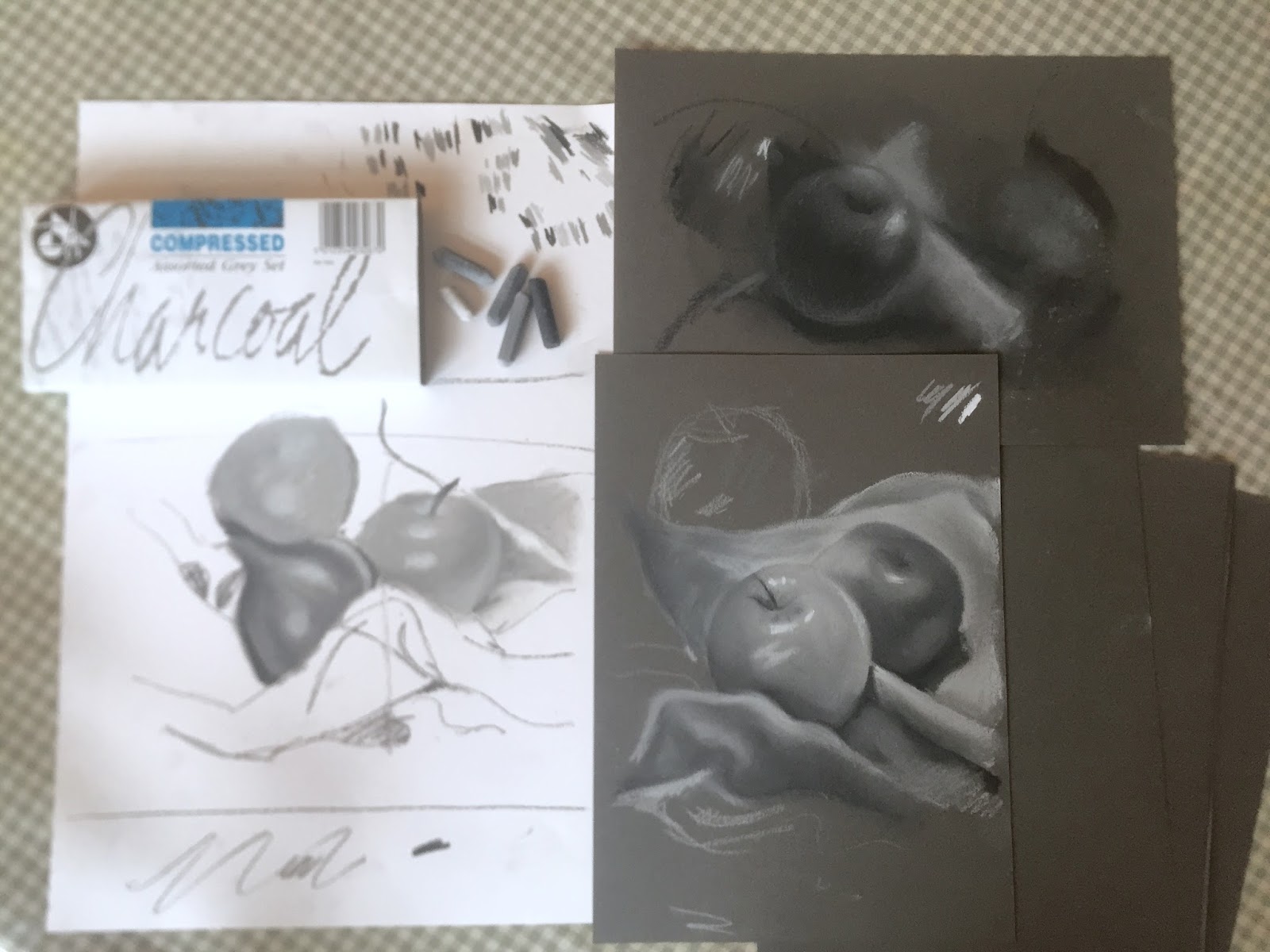
| My demo drawings, with the Compressed Charcoal box top left. |
While most of us enjoy colour (after all, we do live in a colourful world!), working in black and white really improves our abilty to see subtle variations in tones. These same tones are necessary in our colour work too but easily overlooked, giving an unsatisfactory result without depth.
 |
| Demo showing the variety of tones, using only three greys, and white. |
Graphite pencil is excellent for training our eye to see subtle nuances in tones, but using compressed charcoal allows us to cover the whole area in a shorter time frame, helping us to remember to compare tones in areas all across the page (relative to each other) as well as tonal variations which are close together.
 |
| My quick demo on tinted card, with darker tones left hatched rather than blended. |
After arranging the apples and onions pleasingly on cloth, the drawing was lightly mapped in, and the tonal challenge began in earnest. Unlike charcoal, the compressed sticks come in a range of 4 greys plus black and white. The challenge was to remember to change the stick as we went along - leaning more heavily or lightly doesn't alter the tone.
 |
| Lovely artwork by Brigid |
 |
| Another great study by Gavin, who enjoyed the challenge so much that he spent the full session on this artwork. |
It's a dirty business, but once we get stuck in, we become more absorbed in observing the subject than worrying about chalky fingers! We worked on white paper first, and enjoyed the differences when we moved on to the tinted grey paper.
 |
| Dawn, blending nicely |
Working on tinted paper means that the whites really sing out brightly. it is also a pleasure to add highlights, rather than realying on the white of the paper to do the job for us. It's good to vary the tone of our paper - 'white' is not our friend. It can be harsh and cold. A neutral colour is often better as a base to work upon.
 |
| Sara's atmospheric artwork, nearing completion |
 |
| Nisa, who is getting lovely richness in this study. |
 |
| A group of studies - not quite finished, but well on the way. |
Compressed charcoal gives a lovely, velvety texture and laying tones on top of one another creates a wider variety of shades, and the result is very painterly. A delicious exercise, and everyone enjoyed it!
 |
| A wonderful result from Joanne, with excellent tonal ranges. |
Next up in March: Colour pencil and watercolour workshop.
Oil painting workshop. All suitable for all levels of experience.
For information on workshops please email
julie@juliedouglas.co.uk
For information about my book 'Notes from the Atelier', and to see a preview please click
http://www.juliedouglas.co.uk/julies-book/notes-from-the-atelier


No comments:
Post a Comment