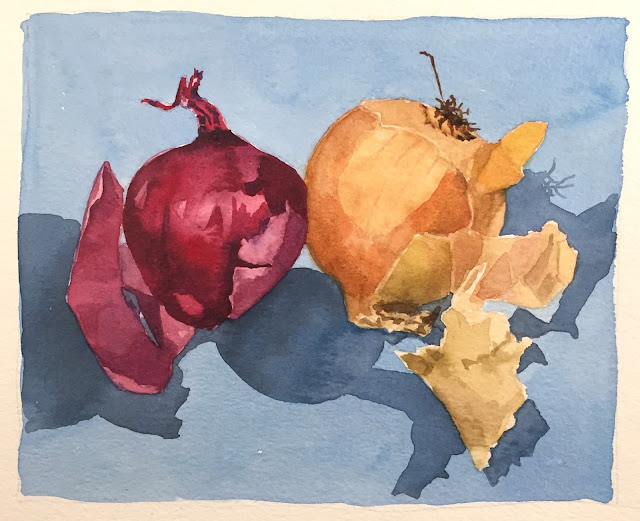
Last night my students were painting in water colour. Onions, in fact. I'd asked them to include a background wash of colour (because white paper is harsh and doesn't always favourably support the subject), which often causes a little anxiety in the room.
When painting with water colour the important thing to acknowledge is that we are painting with WATER, with a little pigment added. It is safe to assume that it will take more than one layer to achieve a fairly 'neat' wash of flat-ish colour, and there are a few tactics which need to be employed in order to get the better of the materials!
The first is to make LOTS of the colour you need - I suggest that students create a lake on the palette. Some folks resist this, not naming any names (you know who you are!!), and at best manage to create a puddle - but inevitably they run out half way through... The down side of that is that it's almost impossible to recreate the same colour, and while you're frantically attempting to make a new puddle, the paint already half-way across the background is drying.. Nooooooo!
The following pictures show the difference between a pudde and a lake...
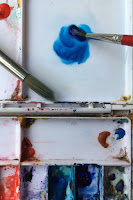
First, add some water to a clean area on your palette. Then introduce some pigment and stir very well.

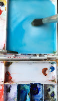
This amount is a 'puddle' and won't go very far across your page. Now is the time to bring a lot more water to the puddle. Use a large brush to almost ladle the water onto the palette. See in the photos below how it disburses the pigment which you'd previously stirred. This is an excellent reminder that we aren't painting with 'paint', but with
stained water. As you add pigment, keep stirring to ensure that the colour is evenly spread in the water. By 'water', I now mean LAKE. Add pigment until you get the colour to the depth of tone you want, and test it not by eye, but by taking a SMALL brush and painting a little tile on your page. It will almost certainly be paler than you expected, in which case add more pigment to the lake, stir again, test again.

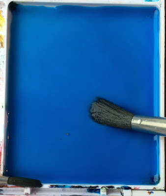 |
| The lake, which resembles a miniature swimming pool! |
When you are satisfied that you have the tone you want, have two brushes handy - a small one for painting close to the objects, and a larger one for very quickly swiping the colour away.
The second tactic is about the order of work.. MANY students automatically start at the top of the page then work downwards. This is a very difficult approach! Instead, I advise that you begin right at the subject itself. Load the small brush with the lake-mix to carefully go around the edge of a section of the subject (an area of no more than 7 or 8 cms!) then swap to the larger brush, fill it with lake-mix and work VERY SWIFTLY to push the colour outwards away from the subject. The aim is to keep all the paint wet until you have covered the background. If it is drying before you are finished it means you are working too slowly... Carefully around the subject then quick-quick-quick to take the colour outwards.
All was going swimmingly (sorry..!) although the first washes were all fairly 'streaky' - this is normal and can be over ridden in a second layer. But then Suzanne asked a totally brilliant question, which transformed the experience for everyone. The question was:
'Why has my wash dried like this?'
I know, fantastic question isn't it?!! I'm sorry that I didn't get a photo of her artwork to illustrate the point, but I will describe it. Her wash, which was actually beautifully done, had dried with some areas darker, some lighter, some lighter again, and several dark rivers where the light and darks 'met'. Not the effect Suzanne was aiming for. I looked at it for a mement then said that she had obviously dipped her brush in her water jar before reloading with the lake. 'Yes, I did!' she admitted. The reason this is so marvellous is that several other students had also done this, effectively altering the lake with every application. Disaster!
But a disaster with a very simple solution. Before you begin painting with your lake-mix, cover your water jar with a tissue and DON'T DIP YOUR BRUSH IN IT UNTIL THE WASH LAYER IS COMPLETE!
Hoorah! Suzanne's second wash was a triumph of paint-magic, and confidence was restored.
This illustrates how sometimes we do something out of habit which has consequences on our page, and also that many apparent problems things have a very simple solution.
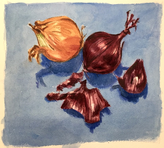
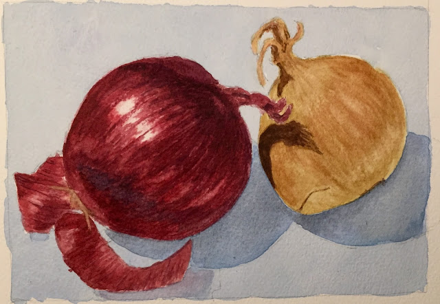
Below are some gorgeous examples by students of their onions and washes. Do not be fooled by the lovely results - most students suffer to produce their artwork - it doesn't come out of the brush all by itself :)
 |
| Brigid |
 |
| David |
 |
| Alan |
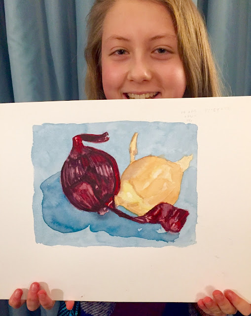 |
| Ewa, aged 15 |
Upcoming workshops - portrait in oils, 17th December, Belfast.
My drawing and painting instruction book, Notes from The Atelier, has now got over 40 five-star reviews on Amazon! Available on Amazon, or directly from me (which is a bit cheaper!). A lovely christmas present for the arty person in your life.
www.juliedouglas.co.uk
email: julie@juliedouglas.co.uk


